At PVsell, we've tried hard to produce a set of charts and infographics that communicate the most-commonly required concepts to your customer. Each is intended to directly address a key purchasing motivation of your customer, and deliver an 'aha' moment of insight.
Each Infographic is also available as a chart without the bounding text above and below it
Infographics on your Results Dashboard (non-battery projects)
- Annual Bill Before and After Solar
- Investment Payback Over Years
- Investment Return
- Annual Breakdown of Benefits
- Energy Sources
- Energy Balance
- Cashflow Positive Investment (i.e., Financial Ownership)
- Repayments/Lifetime Benefits (Comparison of Annual Electricity Bill)
Infographics on your Results Dashboard (Battery Projects)
- Investment
- Annual Bill Before and After Solar (Battery Project)
- Grid Independence KPIs
- Average Daily Energy Flow
- Sample Day Energy Flow
- Daily Energy Balance
- Cheaper Electricity and Cheaper Electricity v2
- Cumulative Net Position
- Annual Electricity Expenditure
- Projected Electricity Prices
- Monthly Consumption
- Weekly Consumption
- Solar Production (i.e., Monthly Production)
- Return On Investment
- Internal Rate of Return
- Annual Solar Savings
- Energy Production vs Consumption
Infographics on your Results Dashboard (non-battery projects)
Annual Bill Before and After Solar
The Annual Bill Before and After Solar infographic/chart presents the customer's electricity bill before a solar system is installed, compared to the customer's electricity bill after the solar system is installed. Also highlighted on the bill is the savings.
This chart is a depiction of first-year financial return
The text beneath the infographic shows the reduction in the annual electricity bill in dollar terms, and in percentage terms.
Note that the percentage terms will be incorrect if standing charges and/or demand charges were omitted from the bill entry.
If the system is financed, then the finance repayments are also indicated on the bill, and the savings will be correspondingly smaller
If the system attracts LGCs, then these will appear to the left of the "bill after solar" bar, as LGCs will not specifically reduce the electricity bill but are a revenue stream that is directly related to the solar production.

Investment Payback Over Years
The investment payback over years infographic/chart depicts the amount of time taken to pay back the initial investment, for a cash purchase. This chart is a depiction of short-to-medium-term financial benefit.
The initial investment is shown in a bar in Year 0, followed by the cumulative revenue over the ensuing years until payback is reached. The point at which payback is reach is depicted by drop lines where the cumulative revenue intersects the initial investment.
The blue text shows the number of years taken to pay back the initial investment.
This infographic/chart depicts True Payback. Click here to learn more about the difference between Simple Payback, True Payback, and Discounted True Payback
If the system is financed, then the information shown on this infographic/chart is not applicable

Investment Return
The investment Return Infographic/Chart depicts the immediate, short term, and long-term financial impact of a solar investment.
The Initial investment is shown, and compared to the first year net benefit. The net financial position in the long term is also depicted. The text in the blue bars shows the Return On Investment and the Internal Rate of Return.
This chart is useful for showing the 'at a glance' net benefit of investment: how far ahead the customer will be at the end of the system life, after paying off the initial investment.
This chart is also useful for showing the initial Return on Investment (the percentage of the initial investment that is recouped in the first year).
If the system is financed, then the investment bar depicts the total amount of repayments, and the First Year Net Benefit depicts the net cashflow in year one (financial benefits less repayment amounts). If the system is financed, then the ROI figure is calculated as the first year revenue divided by the total amount of financial repayments.

Annual Breakdown of Benefits
The Annual Breakdown of Benefits depicts the annual cashflow over the life of the system. This provides the annual outlook on revenue over the long term, and typically depicts benefit that grow as electricity prices rise. The Blue Text provides the annual benefit in the final year of the system life.
The chart depicts each of the major sources of financial benefits, as applicable:
- Power that is export to the grid
- Savings from offset consumption
- LGC revenue
- Reduction in Peak Demand
When the system is financed, the Annual Breakdown of Benefits chart also includes the annual repayments and net annual cashflow

These infographics have a corresponding bar chart (without breakdown) that is also available, as illustrated below.

Energy Sources
The Energy Sources Infographic/Chart depicts the annualised energy balance: the total energy consumption of the site, compared to the total production of the solar system – broken down into the solar energy generation that is self-consumed and the solar energy that is export to the grid.
The Blue Bars show two calculations
- "X% of energy needs met by solar": The average daily solar energy production divided by the average daily electricity load (regardless of whether the solar is export or self-consumed). This valuable KPI indicates how much of the site's total energy consumption is met by on-site production.
- "Y% of generation export to the grid": This average daily export volume divided by the average daily solar energy production. This valuable KPI indicates how much of the generation is export, vs how much is self-consumed on site.
If you've set your project to be export constrained, then the 'Export to Grid' bar will be absent, as the solar production will be curtailed by a corresponding amount

Energy Balance
This chart shows the energy balance between energy consumption and production, which reveals how much energy is import, met by on-site production, or export. The chart shows the Load, Export to Grid, Offset Consumption, and Solar Output.
The text in the blue bars indicates how much energy is export to the grid on an annual average basis.
Note that by clicking on the dropdown arrow, you can view one of four pre-selected days, in order to communicate to your customer that your system design/sizing has accurately accounted for real-world conditions:
- "Typical Export" – PVsell finds the weekday in which the percentage of solar generation that is export for that day is the same as the annual export percentage.
- "Worst Export" – PVsell finds the day of the year that has the most amount of energy export to the grid
- "Best Export" – PVsell finds the day of the year that has the least amount of energy export to the grid
- "High Usage Day" – PVsell finds a day of the year where production and consumption are at their greatest coincident levels.


Cashflow Positive Investment
When the project is financed, this infographic is useful to identify that the savings off the bill exceed the repayments – that the project is cashflow positive.
The text at the bottom of the infographic shows the net cashflow in year 1.
The figures shown are for year 1.
If the repayments exceed the savings (i.e., cashflow negative), then this chart will be automatically replaced with an 'affordable solar ownership' infographic

Lifetime Benefits (Comparison of Annual Electricity Bill)
This chart shows the electricity bill before and after solar, the financial repayments and the net savings, in each year of the system operation.
The blue text shows the total amount of repayments made.
Note that this chart does not include LGC revenue (as LGC revenue doesn't affect the electricity bill)
Note that this chart (without the infographic banners) is more useful in projects without finance

Infographics on your Results Dashboard (Battery Projects)
PVsell displays a set of infographics that are tailored to the needs of battery sales, when batteries are enabled on a project. These are focussed less on the financial performance of the system, and more upon the energy independence aspects of the battery
Investment
The investment pane shows the high-level financial details relating to the solar + storage system.
The Return on Investment and Simple Payback is shown in the main pane of the graph.
The blue text shows the price of the solar & storage system.

Annual Bill Before and After Solar (Battery Project)
The Annual Bill Before and After Solar infographic/chart presents the customer's electricity bill before a solar system is installed, compared to the customer's electricity bill after the solar system is installed. Also highlighted on the bill is the savings.
This chart is a depiction of first-year financial return
The text beneath the infographic shows the reduction in the annual electricity bill in dollar terms, and in percentage terms.
This battery-version of the chart also separates out the savings from the PV and batteries where it is possible to do so

Grid Independence KPIs
Energy Independence is a key reason people are interested in purchasing batteries. This chart quantifies some Key Performance Indicators (KPIs) relating to your customer's journey towards grid independence – from solar on-site generation, through absorbing solar production for later use and reducing grid charges and power draw towards off-grid status.

The first step on the path to energy independence is producing enough energy to power your site. This KPI shows the solar energy generation divided by the total energy consumption. It isn't affected by the amount of battery storage.
If you cannot rely on the grid for back-up power, then you will need to generate much more than 100% of your energy requirements on site – to make sure you've got sufficient energy going into your batteries to cover you during winter or periods of extended cloud.
Solar households hate the fact that their excess energy is bought by their electricity retailer for a paltry amount and then sold to their neighbour for 2-10 times that amount, and then they have to buy back that energy at night for a fortune. This KPI measures how much of the solar energy that would otherwise be export (in the absence of a battery) is absorbed by the battery for later use.
Note that you'll need a very large battery to soak up all of your solar export. In the worst case (i.e., on a day where there's no consumption) you'll need a battery as large as your maximum daily solar production. This is typically your solar capacity multiplied by 6. This will mean your batter is under-utilised the rest of the year.
Some of those electricity prices during peak periods are painfully high – as high as 52c/kWh! Batteries help your customer to avoid those painful peak prices by soaking up cheap energy from solar panels (or during off-peak periods) that then serves the household during peak price periods. This KPI measures the proportion by which your peak prices are reduced. It excludes any benefit outside of peak periods.
If your customer isn't on a Time-Of-Use plan, then this KPI will treat all energy as peak energy, therefore the KPI will be the same as the Reduction In Grid Draw KPI.
This KPI is the best measure of grid independence. It measures how much energy is imported from the grid as a proportion of the total household consumption. The rest of the household energy supply will be met by a combination of the solar system and the battery.
This KPI measures battery utilisation, and should be interpreted in conjunction with "Days with Spare Capacity". This KPI shows what percentage of days the battery is charged to 100% of its capacity. This KPI is intended to guide retailers as to whether the battery is well sized and the battery charge/discharge settings are sensible. This KPI isn't so consumer-focussed.
If the battery is fully charged over 80% of the days of the year, then plenty of solar energy is being spilled to the grid, and the battery could be increased in size to deliver greater solar-soakup or greater grid-independence. Alternatively, you may wish to turn off grid-charging (arbitrage), which may be reducing the opportunity for solar to charge the battery.
If the batter is fully charged less than 50% of the days of the year, then the solar power system could be larger or the battery could be smaller. This would deliver greater battery utilisation and therefore faster ROI.
This KPI measures battery utilisation, and should be interpreted in conjunction with "Days Fully Charged". This KPI shows what percentage of days the battery is discharged to its minimum capacity. This KPI is intended to guide retailers as to whether the battery is well sized and the battery charge/discharge settings are sensible. This KPI isn't so consumer-focussed.
If the battery has more than 50% of days with spare capacity, then it is being under-utilised. Unless you are designing an off-grid system or tackling peak-demand charges, then you want to fully discharge the battery.
If the battery has less than 20% of days with spare capacity then it is regularly being fully drained.
If you don't discharge during off-peak periods, then you will have many days with spare capacity. This may underutilise you battery.
If you want to be fully grid independent (an off-grid system), then the days with spare capacity must be 100%.
This KPI is for those customers who want the lights to remain on during a blackout. This KPI calculates what proportion of a day the battery could keep the lights on, in the event that the power went out without any solar re-charge, and without any reduction in the household's typical consumption level. The calculation is usable battery capacity divided by average daily consumption.
The One Day Storm Blackout Protection KPI doesn't consider whether your battery can technically provide power during a blackout.
The "Days 100% Self-Sufficient (Off-grid Ready)" KPI calculates the ultimate in grid-independence: not having to draw power on the grid at all. The KPI counts the days of the year that there is no power import from the grid, divided by 365. If you want to be 100% off-grid then this KPI will need to be 100%.
Average Daily Energy Flow
The Average Daily Energy Flow chart shows the amount of energy that passes on an average day:
- From the PV direct to the load (self-consumption)
- From the PV to the battery (solar charging)
- From the PV to the grid (export)
- From the grid to the battery (arbitrage or grid charging)
- From the battery to the load (battery discharging)
- From the grid to the load
The amount of energy flow between each point is labelled numerically – the width of the arrows also indicates the amount of energy flow.
The amount of consumption or supply from each source (e.g. solar production, energy consumption, grid supply, and battery losses) in total is also displayed numerically beside the source.
The colour of the arrows is consistent across the three charts: Average Daily Energy Flow, Sample Day Energy Flow, and Daily Energy Balance. So PV->Load is always represented in dark blue in each chart

Sample Day Energy Flow
This chart shows the energy flows on an actual day. It illustrates the customer's load, the battery state of charge, and the solar production, as well as the interplay between all three.
- the customer's load is shown as a black line
- the battery's state of charge (as a dotted purple line)
- the energy flow to the load
- from by solar energy (dark blue),
- the grid (green),
- or the battery (red).
- the energy flow from the solar system
- self consumed (dark blue),
- charging the battery (light blue),
- or export to the grid (orange)
- the energy flow from the grid to the battery (if grid-charging is enabled) – in purple
The text in the blue bar at the bottom of the infographic shows the number of cycles per year the battery will experience.
You can select the day shown using the dropdown arrow in the top right of the infographic
The colour of the areas is consistent across the three charts: Average Daily Energy Flow, Sample Day Energy Flow, and Daily Energy Balance. So PV->Load is always represented in dark blue in each chart

If your battery stops discharging before its empty, it is either because of
- the battery's minimum state of charge (which is an input parameter), or
- the battery is being prevented from discharging during off-peak periods.
If your battery starts the day part-full, then it may limit the amount of solar energy it absorbs. This can happen if:
- you have grid-charging turned on (arbitrage)
- your battery is over-sized
Daily Energy Balance
The Daily Energy Balance chart shows the amount of energy that passes on an average day:
- From the PV direct to the load (self-consumption)
- From the PV to the battery (solar charging)
- From the PV to the grid (export)
- From the grid to the battery (arbitrage or grid charging)
- From the battery to the load (battery discharging)
- From the grid to the load
This bar chart is useful for a visual 'tallying' of the energy supply and consumption
The colour of the bars is consistent across the three charts: Average Daily Energy Flow, Sample Day Energy Flow, and Daily Energy Balance. So PV->Load is always represented in dark blue in each chart

More Graphs
A range of other charts are available below the results dashboard, including the chart-form of the infographics

Cheaper Electricity
This infographic/chart illustrates the price advantage that solar has when compared to the grid.
The infographic shows the Levelised Cost of Solar Energy (LCOE) for the solar system as a red line that is constant across the lifetime of the system. This is compared to the average grid price (blue bar) in the current year and at the end of the solar system life. It is also compared to the average value of solar production, depicted in green (+yellow/amber) bars.
The reason there are two comparisons – one with the average grid price, and one with the value of solar production – is because:
- Most people want to see that the cost of solar production is lower than the average grid price. Effectively you're buying power for cheaper than the grid. This is indicated when the top of the blue bar is higher than the red line.
- A more sophisticated investor wants to know that the value of solar production is higher than its cost. Our chart also includes the value of LGCs (if applicable) and Peak Demand Reduction (expressed in $/kWh to enable a comparison)
This chart also shows that the effective cost of solar energy remains constant – locked in – even as the price of grid electricity (and corresponding value of solar production) rises over the years.
The solar production can have a lower value than the average grid price.
For example, if 100% of the solar generation was exported then the value would only be the feed-in tariff value, which is commonly much less than the average electricity price. Even if 100% of the solar production was self-consumed, the solar production may occur more (or less) during peak tariffs than the electricity consumption; hence the difference in the two metrics.

Note that this chart has a superseded version, illustrated below. It shows only the cost of solar energy (LCOE) and the current value of solar production (without illustrating the effect of electricity price rises).

Cumulative Net Position
This chart shows the cumulative net position for the project finance. The value of this chart is in illustrating the initial investment, the true payback (where the line crosses the $0 point), and the net financial position at the end of the system life.

Annual Electricity Expenditure
This chart shows the customer's electricity bill before and after solar is installed, for every year of the system operation.

Projected Electricity Prices
This chart shows the projected electricity prices over the life of the system.

Monthly Consumption
This chart shows the average daily consumption profile for each month of the year
You can hide and show the lines on the chart by clicking on their legend

Weekly Consumption
This chart shows the average daily consumption profile for each weekday
You can hide and show the lines on the chart by clicking on their legend

Solar Production
This chart shows the average daily solar generation for each month of the year

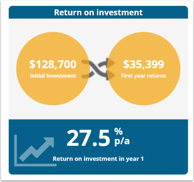
Return On Investment
This chart has been superseded, replaced by the Investment Return Infographic
This chart shows the transformation of the initial investment into first year returns.
The text in the blue bars indicates the result of the ensuant Return on Investment calculation

Internal Rate of Return
This chart has been superseded, replaced by the Investment Return Infographic
This chart shows the transformation of the initial investment into cumulative returns over the project life.
The text in the blue bars indicates the result of the ensuant Internal Rate of Return calculation
0 Comments